This guide contains affiliate links. As an Amazon Associate we earn from qualifying purchases, at no extra cost to you.
Paint is the cheapest way to transform a room, and also the easiest place to waste money. A tin that looked perfect on the chart can turn grey, green or icy on your wall. The good news is that choosing a colour scheme is a process, not a talent. Follow these steps and you’ll buy paint once.
Step 1: Start with what’s staying
Before you look at a single paint chart, list everything in the room you aren’t replacing: the sofa, the carpet or floorboards, the kitchen worktop, a rug, a favourite print. These are your fixed colours. A scheme that works with them costs nothing extra. A scheme that fights them means buying new things.
Look closely at the undertones. A “grey” carpet may lean warm (beige or pink) or cool (blue or green). Your wall colour should share that warmth or coolness.
Step 2: Check which way the room faces
Natural light changes colour more than anything else.
- North-facing rooms get cool, even light all day. Cool greys and blue-whites can look cold and flat here. Warm whites, soft yellows, warm greys and earthy greens work better. Deep colours can look wonderful and cosy.
- South-facing rooms get warm, bright light. Almost anything works, and cooler colours like soft blues and greys stay fresh rather than cold.
- East-facing rooms are bright and warm in the morning and cooler later. Pick for when you use the room most.
- West-facing rooms are cooler in the morning and glow in the evening. Warm neutrals look lovely at sunset.
Step 3: Pick a mood, not a colour
Ask how you want the room to feel. Calm and restful (bedrooms): soft greens, muted blues, warm off-whites. Sociable and warm (living rooms, dining rooms): terracotta, ochre, deep green, warm neutrals. Fresh and bright (kitchens, bathrooms): clean whites, pale sage, soft blue.
Once you know the mood, the shortlist of colours gets much shorter.
Step 4: Use the 60-30-10 rule
Designers use a simple ratio to keep a room balanced:
- 60% main colour. Usually the walls. It sets the mood.
- 30% secondary colour. Furniture, curtains, a rug or a painted feature wall.
- 10% accent colour. Cushions, a lamp, artwork, a vase. This is where you can be bold, and it’s cheap to change.
A room that follows this rule looks pulled together even on a tiny budget.
Step 5: Borrow a palette from something you love
The easiest way to find colours that work together is to take them from a single object: a rug, a print, a scarf, even a photo of a holiday. The designer has already done the hard work. Pick the lightest shade for the walls, a mid-tone for the 30%, and the boldest for accents.
Step 6: Test properly before you buy
This step saves the most money.
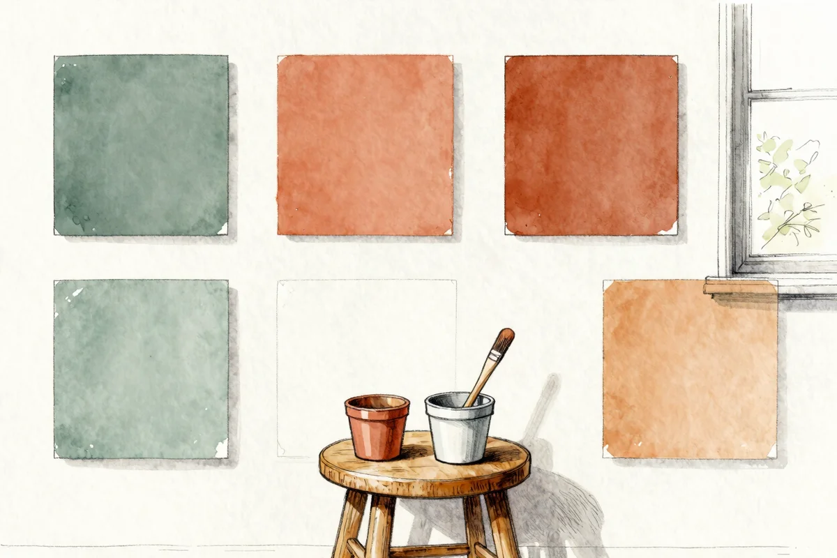
- Buy sample pots, not tins. Two or three samples cost far less than one wrong tin.
- Paint large swatches. Use an A3 sheet of lining paper or card for each colour, with two coats. Tiny squares on the wall lie.
- Move them around. Look at the swatches on different walls, next to the window and in the darkest corner.
- Check morning, afternoon and evening. And again under your own lamps.
- Live with them for two days. The one you still like on day two is the one.
Step 7: Don’t forget the ceiling and woodwork
Brilliant white ceilings and skirting can look harsh next to warm walls. A softer white, or the wall colour diluted for the ceiling, looks more expensive. For a modern look, paint the skirting the same colour as the walls.
Five budget-friendly colour schemes that always work
| Mood | Walls (60%) | Secondary (30%) | Accent (10%) |
|---|---|---|---|
| Calm and natural | Warm off-white | Sage green | Terracotta |
| Cosy and rich | Deep green | Warm wood | Mustard |
| Light and airy | Soft white | Pale blue-grey | Navy |
| Warm and earthy | Mushroom beige | Rust | Olive |
| Soft and romantic | Dusty pink | Cream | Deep plum |
Common mistakes
- Choosing from a tiny chip. Colours look much stronger on a whole wall.
- Pure white in a dark room. Without sun it turns grey. A warm white or a mid-tone looks better.
- Too many colours. Three is plenty for most rooms. Repeat them.
- Ignoring the next room. In an open-plan or small home, keep the same undertone running through so rooms flow.
Frequently asked questions
What is the 60-30-10 rule?
It’s a guide for balancing colour: 60% of the room in a main colour, 30% in a secondary colour and 10% in an accent colour.
What colour makes a small room look bigger?
Light, warm neutrals and pale colours reflect the most light. Painting walls and woodwork the same colour also blurs the edges and makes a room feel larger.
How many paint samples should I try?
Two or three close shades of the colour you like is ideal. Testing very different colours at once makes it harder to decide.
Leave a Reply